CSS Flexbox
To consider Flexbox we need to first understand what a layout is. In CSS (Cascading Style Sheets), a layout refers to the arrangement of elements on a webpage. It involves positioning and displaying elements in a specific manner to create a desired structure and appearance. Flexbox is a set of related CSS properties for building 1-dimensional layouts. The main idea behind flexbox is that empty space inside of a container element can be automatically divided by its child elements.
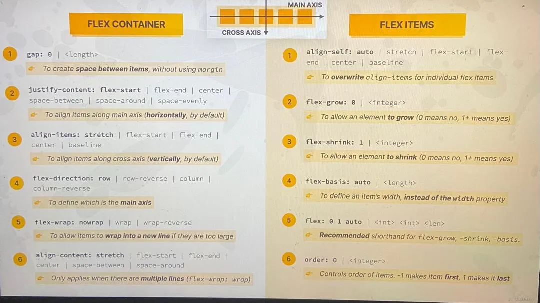
- The element on which we want to use flexbox is called flex container.
- The direct children of the flex container are called flex items.
- The direction in which the flex items are laid out is called the main axis, then the other perpendicular axis is called the cross axis.
Below are CSS styles that can be applied to both flex container and flex items
Flex Container Styles
-
display: flex or display: inline-flex
-
Turns the element into a flex container, allowing its children to become flex items.
-
display: flex makes the container a block-level element.
-
display: inline-flex makes the container an inline-level element.
-
-
flex-direction
- Defines the direction in which flex items are placed in the flex container.
- Values: row (default, horizontal), row-reverse, column (vertical), column-reverse.
-
justify-content
- Aligns flex items along the main axis (horizontally for row, vertically for column).
- Values: flex-start (default, start of the container), flex-end (end of the container), center (center of the container), space-between (evenly spaced, first item at start, last item at end), space-around (evenly spaced with equal space around them).
-
align-items
- Aligns flex items along the cross axis (vertically for row, horizontally for column).
- Values: stretch (default, stretch to fill container), flex-start, flex-end, center, baseline (align along the text baseline).
-
flex-wrap
- Determines whether flex items should wrap onto multiple lines.
- Values: nowrap (default, all items on one line), wrap (wrap items to new lines), wrap-reverse (wrap items to new lines in reverse order).
-
Gap
- To create space between items without using margin.
Flex Item Styles
-
order
- Specifies the order of the flex items within the flex container.
- Default value is 0. Higher numbers move the item further back in the order, and lower numbers move it further forward.
-
flex-grow
- Defines how much a flex item should grow relative to the rest of the flex items.
- Default value is 0 (no growth). A value of 1 allows the item to grow and fill available space.
-
flex-shrink
- Defines how much a flex item should shrink relative to the rest of the flex items when there is not enough space.
- Default value is 1 (allows shrinking). A value of 0 prevents shrinking.
-
flex-basis
- Specifies the initial size of the flex item before any remaining space is distributed.
- Can be set to any valid CSS size value (px, %, auto, etc.).
-
align-self
- Overrides the align-items value for individual flex items.
- Values: auto (default, inherits from align-items), flex-start, flex-end, center, baseline, stretch.
Of course, learning all these styles is crucial to become a high performance web developer, that is why i provided a pictorial guide below that you can reference before mastering all the styles off hand. It is advisable to print this out and also store in your mobile phone for quicker access